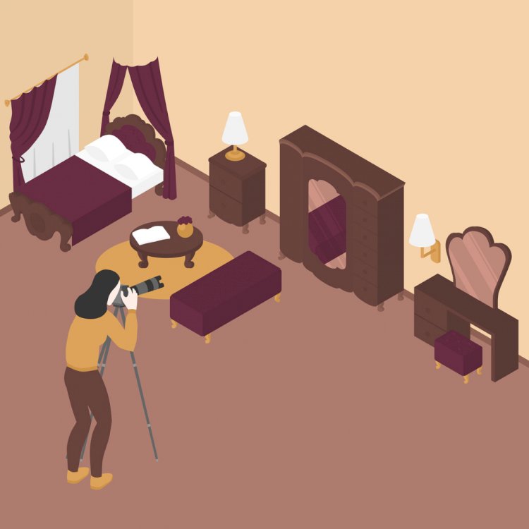
Taking Better Promotional Pictures: 5 Tips to Stand out
Getting your properties noticed by potential renters, especially those who live far away, can be difficult. To give you an extra leg up, your listings need to have phenomenal photos to accompany them.

Getting your properties noticed by potential renters, especially those who live far away, can be difficult. To give you an extra leg up, your listings need to have phenomenal photos to accompany them.
If you’re like most people, though, photography is something that you typically reserve for quick snaps with your phone when you’re out with friends and family.
To help you step up your promotional picture-taking game, here are 5 tips recommended by professional photographers:
Select a Clean Space

Just as a cluttered, overly decorated space makes potential renters feel claustrophobic in person, a cluttered, overly decorated space can ruin your promotional pictures.
Whenever possible, clear the area where you’re taking pictures of anything unnecessary, including furniture, renters’ personal items, and dishes. It is usually best to take your promotional photos when a unit is empty to keep things as clear as possible.
Additionally, make sure that you check the space you’re photographing for any flaws that could be distracting in a photograph, including chipped paint, holes in the wall, or stained carpeting. These flaws may be more noticeable in a photo than they are in real life, and that can negatively impact a potential tenant’s impressions of your property.
Check the Lighting
The right lighting can make a huge difference in how your promotional pictures appear.
If everything is too dark or the lighting is too overblown, it can change the entire photo for the worse. In the case of a too-dark photo, the space can look dank, dingy, and dirty. For a photo with overblown lighting, you can highlight the wrong features of the room and create shadows where they don’t actually exist.
Do your best to take photos with the most natural daylight as possible, but not midday lighting. Late-morning light is usually best, unless the unit doesn’t have any windows that can receive this lighting.
If necessary, add some strategic lamps and other lighting to help properly illuminate the rooms so you get great photos.
Stage Properly

When prospective tenants see the spaces you have to offer, you want them to be able to picture themselves in the space enough that they decide to rent from you.
While it may seem as if having a completely blank space is ideal for this, you actually want to have your units staged so they look homey and inviting. This means having some furniture in each of the rooms, cozy-looking pillows and blankets, and neutral decor.
If you have to take staging photos while you still have tenants living in a unit, work with them to ensure the space is as clean, decluttered, and staged as possible before you take photos. You may want to bring some small staging items with you such as baskets and pillows to help jazz up the area.
When you have a completely empty unit to photograph, it may be helpful to keep a small stash of furniture, home goods, and decor that can be your go-tos to help stage units. You don’t necessarily need a lot, but just enough to make a space feel lived-in even when it is empty.
Try Different Angles
It may seem easiest to just take a photo of each room in a unit from the door and call it a day. However, taking just one photo of each room - and even photos all at your eye level - doesn’t fully do the unit justice.
Try to take photos of each room from a variety of angles, giving yourself different perspectives to choose from when selecting photos for your advertisements. Get down close to the ground for a few in each room, and up on a step stool for a couple.
Seeing the space from a variety of angles and perspectives helps give potential tenants the ability to better visualize each room. Additionally, some angles will help a room look more open and inviting than a straight-on shot, making everything look more welcoming.
Follow the Rule of Thirds

The rule of thirds is a photography concept that splits the field of an image into three equal parts, with the subject placed at the intersection of at least two of the sections. While this rule is largely used for objects and living subjects, it still works well for photographing spaces.
Rather than centering a sofa in a photo of a living room, for example, apply the rule of thirds and shift the frame of the camera over a bit, leaving some space at the edge of the image.
When you separate an image into thirds, it becomes more visually pleasing and attractive. Employing the rule of thirds can make the space look more open and pleasing, giving potential tenants a pleasant feeling about your units before they ever set foot in the door.
Cloud-Based Property Management Software
As a property manager, you wear a lot of hats. You need to balance the books, keep track of employees and contractors, and market your empty units, often all in the same day.
Keep on top of your to-do list with Sugu from @Assist. This cloud-based platform brings together all your tenant communications, work orders, banking information, time management tools, and more all in one easy-to-use, intuitive platform. Try it today!

 contact@atassist.com


