Crafting Colourful Spaces: 3 Complementary Colour Groupings to Try
Moving into your own space means you get to put your own stamp on everything and let your personality shine. From the window coverings to the pictures you hang, the pillows and linens to the color of the walls, you get the opportunity to make the space truly yours.
 contact@atassist.com

Moving into your own space means you get to put your own stamp on everything and let your personality shine.
From the window coverings to the pictures you hang, the pillows and linens to the color of the walls, you get the opportunity to make the space truly yours. But don’t go too crazy picking out a whole bunch of paint and accessories just yet; you want to make sure that whatever colours you choose for the walls - and any accent pieces - work well together to create a harmonious, happy home.
To get the right balance of colors in your new space, you’ll need to make use of the colour theory.
What Is the Colour Theory?
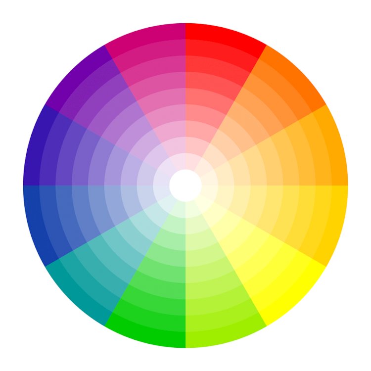
Do you remember that colour wheel from elementary school art class? That is the exact same colour wheel at work in the colour theory.
Colour theory says that colours that are opposite one another on the wheel are complementary, or look especially good together. Using these complementary colours in a space creates a sense of harmony, where using colours that are not opposite one another on the colour wheel can feel too busy.
When it comes to colour theory, there are three major groupings of complementary colours: red and green, yellow and purple, and orange and blue. Different saturations and shades of these colour groupings can yield different feels, each lending its own unique touch to your space.
Here’s how to use each of these groupings in your home:
Reds & Greens
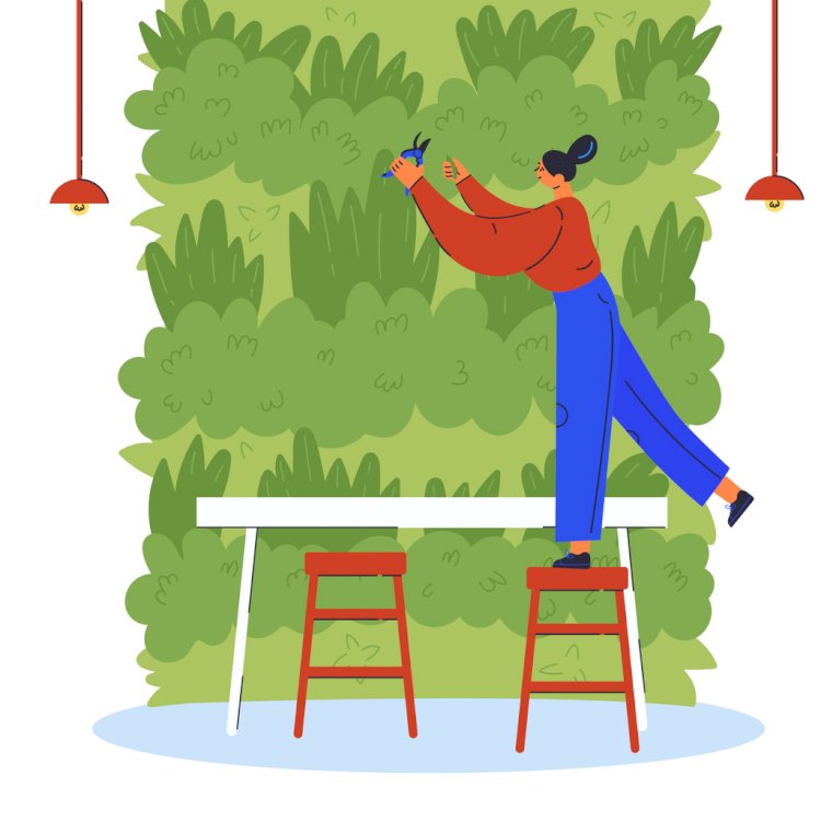
While you may feel it’s difficult to put these two colours together without it screaming “Christmas,” but there are plenty of ways to group red and green without it feeling too festive.
Part of the secret to making these two hues work well together is to step out of thinking of bright emeralds and crimson red when using red and green. Instead, take one of the two to a different shade, such as a sage green or a more muted terra cotta and go from there.
Also, breaking up the red and green with lots of neutrals such as cream can keep them from feeling overwhelming.
Choose patterned furniture or tapestries in shades of red and green on bases of neutrals rather than going for solids. Adding in some silver with your decor can help things feel elegant without being too holiday.
Yellow & Purple
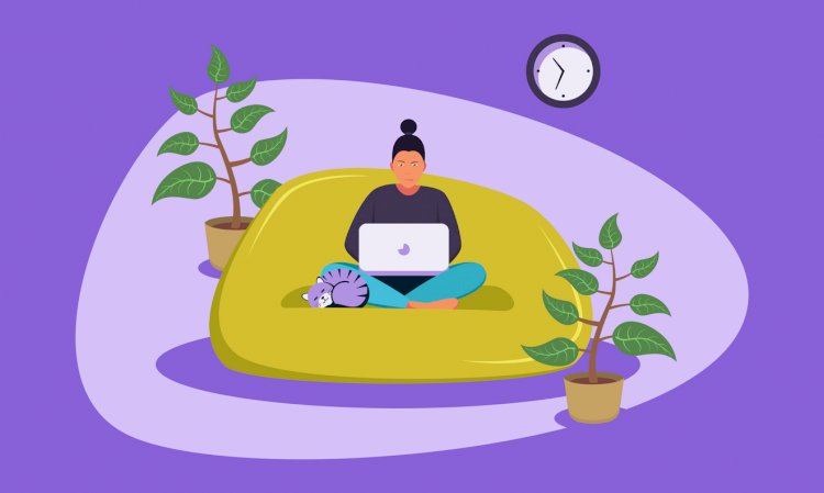
If you’re looking to create flirty, romantic spaces, going for yellows and purples is the right direction.
Unless you’re going for something really big and bold, you want to select more muted tones of both these colors, and it is probably best to use one colour more prominently than the other to avoid things feeling too busy.
Accent a great dusty purple couch with a gold ottoman and some throw pillows, or add a purple rug and drapes to surround your yellow-upholstered chairs.
Orange & Blue

Do you want an exotic, bold feel to your space? Blue and orange is just the colour combination for you.
Rather than using the straight primary hues of these two colours, going for deeper tones can give you the earthy feel you desire without making everything seem like a circus. Ground your deep orange sofa with some pale blue pillows and lamps, or hang some orange drapes and toss a few orange-and-white throw blankets across light blue furniture.
This colour scheme, like red and green, is perfect for beautiful silver accent pieces such as lamps, picture frames, and statues.
Remote Property Management Made Easy
Managing your rental properties from afar can be a difficult task. You have to keep tabs on all your tenants, employees, contractors, and potential renters, without actually being present.
If you have to manage your properties from far away, Sugu can help. This cloud-based platform helps you manage tenant communications, task lists, maintenance requests, rental applications, payments, and more all from any device that has internet. This easy-to-use platform grows as your team grows, giving you endless flexibility. Try Sugu today!