The Global Journey: Part 1 - New Website
The Global Journey is a set of posts chronicling our journey from one country to the world, from national to international, from one ocean to....you get the idea. Follow along on our journey which will feature the good and the bad with a little hilarious in between. Sign up for notifications when a new post is added by clicking on the button that looks like this on the bottom left of the website.

The Global Journey is a set of posts chronicling our journey from one country to the world, from national to international, from one ocean to....you get the idea. Follow along on our journey which will feature the good and the bad with a little hilarious in between. Sign up for notifications when a new post is added by clicking on the button that looks like this on the bottom left of the website.
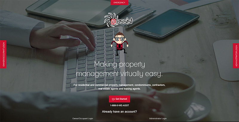
On an unusually warm December morning in 2015, a big decision was being made. @Assist, the property management assistant of Canada would become @Assist, cloud-based property management for the world. As we started to plan the future, there was one change that would immediately need to be made. Our website.

When creating our previous website, we did what most companies commonly do: put a whole lot of information in a small amount of space. This was a little tough to digest for the average bear and we found it left most of our visitors overwhelmed. Immediately they would think our service wasn't for them with the little guys saying, "oh this looks like a service for the big guys" and the big guys saying, "oh this looks like a service for the little guys". Frustrating, to say the least.
@Assist is a service that can actually service both markets (as well the one in between) but with a website that said absolutely everything, how could each market relate? The simple answer is that they couldn't. And while we loved the look and the feel, we shed a little tear and decided to simply simplify.

The new website was quite the undertaking and never were we more thankful for having in-house developers. We actually went through several designs before landing on the simple idea to play off where our service lives, in the cloud!
With a new theme in mind, we broke our website sections into our target markets. Property management is a diverse industry with lots of different types of people renting and managing properties. By breaking them into groups, we could create sales funnels that pertained to each market, therefore making the look and feel of the website much simpler. To further enhance our sales funnels, we color-coded them and designed characters with a story that targets each market.

The new website launched in May and the response so far has been great! And as a company should, we will continue to test and modify as we receive feedback and comments.
Click here to view The Global Journey: Part 2 - Making a Video.

 contact@atassist.com


